.svg "Palmer Logo (1)")
 How can you increase sales and give your customers a satisfying in-store experience? With signs that appeal to their planned and unplanned shopping needs. Done well, store signage can assure your success; but done poorly, signs can sabotage your store’s environment and deaden sales. The key is understanding the psychology of store signage.
Some store signage is purely practical, but signs can also educate shoppers about your products, lead them to more merchandise they might like, and dramatically influence their decision to buy. That’s why perfecting your signs is a direct route to increased sales and greater profitability.
What can you do?
To understand which colors are most effective for different types of signs, learn how different colors affect us. Signs carry a message in words, but they also convey images and mood via color.
Think the importance of color is overstated? The psychology of color and its influence on consumers has been documented in numerous scientific studies. For example, you’ve probably read that blue evokes feelings of trustworthiness, no doubt why so many banks use blue in their color schemes. And, in fact, one study published in the Journal of Business Research showed customers are 15% more likely to return to a store that uses blue than one that uses orange in their color scheme.
Impulse buys: Give them what they want, even if they don’t know what that is.
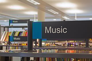
The more visible your merchandise is, the more likely people are to buy. That seems obvious, perhaps, but store signage can boost visibility in important ways. For shoppers who know what they want, signage leads the way. But you also want to lead them past -- and directly to -- impulse buying opportunities.
Capitalizing on impulse buys is critical. One analyst says impulse shopping accounts for as much as two-third of all purchases.
Ensure your store signage sends the right message:
- Double-check to be sure signs are level.
- Post them at a comfortable height – not so high that they obstruct cross-store visibility or customers miss them altogether, but not below waist level. Next to or just above your display always works.
- Use a simple bold typeface that’s easy to read from where customers will be standing. If your official corporate font works well on signs, use that to reinforce your branding. But consistently use a single font for all your signage.
- Replace signs the minute they start to look worn or faded, because like everything else they reflect your store’s quality and attention to detail. Refreshing signage as you change the merchandise in your displays is an easy way to retain a sense of newness, so your store signage doesn’t become invisible to regular shoppers.
The more you know about the psychology of color and store signage, the more effectively you will be able to combine them to drive more sales -- from customers on a mission to buy and from customers who had no idea they wanted those impulse items they just purchased. It’s all about psychology.

Palmer Retail Solutions strives to offer our clients the absolute best combination of innovation, quality, service, and value for our diversified custom store fixtures and merchandising displays. For more information about our designs, retail fixtures, cash wraps, kiosks, or point of purchase displays, visit our website at: http://www.palmerretailsolutions.com.